

Natural and eco-friendly deodorants have become increasingly popular in recent years, and as a result, the demand for sustainable deodorant packaging and label design has also increased. A well-designed deodorant label can be a powerful marketing tool that not only attracts customers but also communicates the values of your brand. In this article, we’ll discuss the importance of natural and eco-friendly deodorant label design and provide tips for creating a successful design.
The importance of natural and eco-friendly deodorant label design goes beyond aesthetics. Customers are becoming more conscious of the impact that their purchases have on the environment, and they are actively seeking out products that are sustainable and environmentally friendly. By designing a label that highlights the natural and eco-friendly aspects of your deodorant, you can appeal to this growing market.
In addition to the environmental benefits, natural and eco-friendly deodorants are also better for the health of the user. Traditional deodorants often contain harmful chemicals, such as aluminium and parabens, which have been linked to health issues such as breast cancer and Alzheimer’s disease. By using natural ingredients, such as essential oils and baking soda, in your deodorant, you are providing a safer and healthier alternative to customers.
Highlight the natural ingredients: One of the key selling points of natural and eco-friendly deodorants is the use of natural ingredients. Highlight these ingredients on your label and include information about their benefits. For example, if your deodorant contains lavender oil, include information about how lavender oil is a natural antiseptic and has a calming effect on the skin.
Use eco-friendly materials: In addition to using natural ingredients in your deodorant, it’s important to use eco-friendly materials in your packaging and label design. Opt for materials that are recyclable or biodegradable, such as kraft paper or plant-based plastics.
Keep it simple: When it comes to label design, less is often more. A simple and clean design can be more effective in conveying the natural and eco-friendly aspects of your deodorant than a cluttered and busy design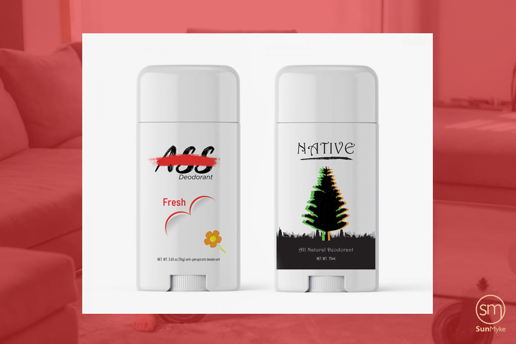
Consider the font and colour scheme: The font and colour scheme of your label design can also communicate the values of your brand. Opt for a font that is easy to read and complements the overall design of your label. When choosing a colour scheme, consider colours that are associated with nature, such as green or brown.
Include certification logos: If your deodorant is certified organic or cruelty-free, be sure to include the relevant logos on your label. These logos can provide credibility and assurance to customers that your deodorant is indeed natural and eco-friendly.
Provide information about sustainability: In addition to highlighting the natural and eco-friendly aspects of your deodorant, provide information about your company’s sustainability practices. This can include information about your use of renewable energy, your recycling program, or your commitment to using locally sourced ingredients.
Meow Meow Tweet: This brand’s deodorant label design features a simple and clean design, with a focus on natural ingredients. The label includes information about the natural ingredients used, such as coconut oil and arrowroot powder, as well as the fact that the deodorant is vegan and cruelty-free.
Native: Native’s deodorant label design includes a prominent logo that communicates the brand’s commitment to using natural and safe ingredients. The label also includes information about the fact that the deodorant is aluminium-free and paraben-free, as well as the fact that the packaging is recyclable.
The deodorant industry is highly competitive, with many brands vying for the attention of consumers. In such a crowded market, the design of a deodorant label can make or break the success of a product. The label is often the first point of contact between the product and the consumer, and as such, it needs to be eye-catching, informative, and appealing.
A well-designed deodorant label can create a positive first impression, help establish a brand identity, and convey important information about the product. The label design can communicate the brand's values, such as its commitment to natural and eco-friendly ingredients. It can also provide important information about the product's ingredients, usage instructions, and safety warnings.
In addition to its visual appeal, the design of a deodorant label can impact a product's success by meeting regulatory requirements. In many countries, deodorants are considered cosmetic products, and their labelling must comply with strict regulations. Failing to comply with these regulations can result in legal penalties, negative publicity, and a loss of consumer trust.
In summary, the design of a deodorant label is crucial for the success of a product. It can help create a positive first impression, establish a brand identity, convey important information, and meet regulatory requirements. A well-designed deodorant label can give a brand a competitive edge in a crowded market, while a poorly designed label can have the opposite effect.
Understanding the brand identity is crucial when it comes to deodorant label design. A brand identity is a set of characteristics, values, and features that define a brand and differentiate it from its competitors. Deodorant manufacturers need to understand their brand identity because it helps them to create a unique and authentic product that resonates with their target audience.
The deodorant label design is the first point of contact that consumers have with a product. It is the visual representation of the brand identity and communicates the brand's values, story, and personality. The label design should therefore be consistent with the brand identity to create a cohesive and memorable brand experience.
For example, if a brand's identity is based on natural and eco-friendly ingredients, the label design should reflect this through the use of earthy tones, natural textures, and imagery that depicts nature. This not only creates a cohesive brand experience but also helps to attract and retain consumers who are interested in natural and eco-friendly products.
Incorporating the brand identity into the deodorant label design also helps to establish brand recognition and loyalty. Consumers are more likely to remember a brand and its products when they have a strong visual identity that is consistent across all touchpoints. This can lead to repeat purchases and even advocacy, as loyal customers recommend the brand to others.
Therefore, deodorant manufacturers need to understand their brand identity and incorporate it into their label design. This helps to create a unique and memorable product that resonates with consumers and establishes brand recognition and loyalty.
During the design process of a deodorant label, it is important to consider the brand's values, target audience, and competition. These factors can greatly influence the design and overall success of the product.
Firstly, the brand's values should be reflected in the label design. This includes the use of appropriate colours, typography, and imagery that align with the brand's mission and vision. For example, if the brand emphasizes natural and eco-friendly ingredients, the label design should use earthy tones and natural imagery to reflect this.
Secondly, the target audience should be taken into account. The design should appeal to the preferences and interests of the intended consumers. For example, if the target audience is young adults, the design should be trendy and eye-catching. If the target audience is health-conscious individuals, the label design should emphasize the natural and organic ingredients used in the product.
Lastly, the competition should be analyzed to ensure that the label design stands out from other products on the market. The design should be unique and memorable while remaining true to the brand's values and target audience. This can be achieved through the use of bold typography, unique shapes, and eye-catching colours.
Overall, by considering the brand's values, target audience, and competition, the deodorant label design can effectively communicate the product's unique selling points and increase its success in the market.
Choosing the right colours and typography is an important aspect of deodorant label design, as it can strongly influence the consumer's perception of the product and the brand. Here are some considerations for selecting colours and typography for deodorant labels:
Brand Identity: The colours and typography used on the label should be in line with the brand's overall identity. For example, if the brand is positioning itself as natural and eco-friendly, using earthy colours such as green, brown or beige can help reinforce this image.
Target Audience: The colours and typography used on the label should also be appropriate for the target audience. For example, if the target audience is young and trendy, bright colours and bold typography may be more effective, while a more mature audience may prefer subdued colours and elegant typography.
Colour Psychology: Colours have different psychological effects on people, and this should be considered when designing a deodorant label. For example, green is associated with nature and freshness, while blue is associated with trust and reliability. Red can be used to create a sense of urgency or excitement.
Typography: The typography used on the label should be legible and appropriate for the product and brand. For example, a playful and fun font may be used for a deodorant aimed at young people, while a more traditional and elegant font may be used for a premium product.
Contrast: The contrast between the colours and typography on the label can also affect its readability and impact. A high contrast between the text and background can make the label stand out more, while a low contrast can create a more subtle and sophisticated effect.
When designing a deodorant label, it is important to consider all of these factors to ensure that the label effectively communicates the brand's message and appeals to the target audience. A well-designed label can make a significant impact on the success of the product.
In a crowded market, a product must have a label design that catches the consumer's eye and stands out from the competition. This is especially important in the case of deodorant, where there are numerous brands and options available.
To achieve an eye-catching design, designers must first understand the importance of balance and contrast. The label design should have a balanced composition with clear contrast to make the product stand out on the shelves. This can be achieved by using complementary colours, bold typography, and a clean layout.
One technique that is commonly used in deodorant label design is the use of vibrant and bold colours. Bright and lively colours can help grab the attention of the consumer and convey the product's energy and vitality. For example, green is often used in natural and eco-friendly deodorant labels to communicate freshness and sustainability, while blue is used to evoke a sense of calmness and purity.
Typography is another crucial element in label design. It not only communicates information about the product but also sets the tone and personality of the brand. Sans-serif fonts are often used in deodorant label design for their clean and modern appearance, while script fonts can add a touch of elegance and sophistication.
Another effective design technique is the use of texture and patterns. Incorporating textures or patterns in the label design can add depth and interest, making the product more visually appealing. This can be achieved by using natural or organic textures to communicate the product's natural ingredients or using geometric patterns to create a modern and sleek look.
In addition to these design techniques, designers should also consider the product's packaging and display. The label design should be created with the packaging in mind, ensuring that the label fits seamlessly onto the product's container. Designers should also consider how the product will be displayed on shelves and how the label design can stand out among the other products.
Overall, an eye-catching and effective deodorant label design should be able to convey the brand's message and values, appeal to the target audience, and stand out among the competition. By using a combination of balance, contrast, colour, typography, texture, and pattern, designers can create a label design that effectively communicates the product's benefits and catches the consumer's attention.
Including accurate and informative product information on the deodorant, the label is crucial for consumer trust and compliance with regulations. However, it's important to also ensure that this information is presented in a visually appealing way that aligns with the brand's identity and message.
Firstly, the product name should be prominent and easy to read. It's important to choose a font that is clear and legible and to ensure that the product name is large enough to be easily identified from a distance. In addition, it's important to consider the placement of the product name on the label. It should be placed in a position that allows it to stand out and be easily seen amongst other competing products.
Next, the ingredients list is a critical element that should not be overlooked. The ingredients list should be presented in a clear and easy-to-read manner, using a legible font size and typeface. It's also important to ensure that the ingredient list is complete and accurate, with all necessary information included. Including any certifications or badges for organic, vegan or cruelty-free products is a plus as it also helps to set the product apart from its competitors.
Additionally, usage instructions should be clear and concise, using a legible font and providing all necessary information for the consumer to use the product effectively. It's important to use simple and direct language that is easy for the consumer to understand.
Incorporating all of this information into a design that is both aesthetically pleasing and easy to read can be a challenge. However, there are some design techniques and strategies that can be used to achieve this. Using clear and contrasting colours for the text and background can help to increase readability. Adding bullet points, numbering, or separating sections with lines can also help to improve clarity and organisation.
The placement of the information is also important. Grouping related information together, such as the ingredients list and usage instructions, can help to make the label more organised and easier to read. It's also important to consider the size and placement of the text, ensuring that it's not too small or too large for the label.
In summary, including necessary product information on the deodorant label is important for consumer trust and compliance with regulations. However, it's equally important to ensure that this information is presented in a way that is aesthetically pleasing and easy to read. Using clear and contrasting colours, logically organising information, and using a legible font can all contribute to creating an effective deodorant label design.
Deodorants are available in various forms, including roll-ons, sprays, sticks, and more. Each type of deodorant requires a different label design to make it easier for the consumer to identify the product and use it correctly.
Roll-on deodorants are popular among consumers who prefer a more natural approach to personal care. The label design for roll-on deodorants should emphasize the natural ingredients used in the product. The label should feature green or earthy tones and a simple, clean design that reflects the product's eco-friendly image. The typography should be legible, and the font style should be simple and easy to read.
Spray deodorants are convenient and easy to use, making them a popular choice among consumers who are always on the go. The label design for spray deodorants should feature bold, vibrant colours that attract attention and communicate the product's efficacy. The typography should be large and bold to make it easy to read from a distance.
Stick deodorants are another popular choice among consumers. The label design for stick deodorants should emphasize the product's ease of use and portability. The label should feature a simple, clean design with a focus on the product's key benefits. The typography should be legible and easy to read, with a simple font style that complements the overall design.
In summary, the label design for deodorants should be tailored to the type of product being sold. Roll-on deodorants should emphasize the product's natural ingredients, spray deodorants should focus on their effectiveness, and stick deodorants should highlight their ease of use and portability. By understanding the unique qualities of each type of deodorant, label designers can create designs that effectively communicate the product's benefits and appeal to the target audience.
In recent years, there has been an increasing focus on sustainability and eco-friendliness in all areas of business, including product packaging and labelling. Deodorant label design is no exception to this trend, and it is becoming increasingly important for brands to incorporate sustainable and eco-friendly design elements into their product labels.
One way to do this is by using recycled or biodegradable materials for the label itself. This not only reduces the environmental impact of the product but also communicates to the consumer that the brand is committed to sustainability.
Another way to incorporate sustainability into deodorant label design is through the use of eco-friendly printing methods, such as soy-based inks or water-based inks. These inks are less harmful to the environment than traditional petroleum-based inks and can also create a unique and visually appealing effect on the label.
In addition to using sustainable materials and printing methods, brands can also communicate their commitment to sustainability through the use of messaging and design elements on the label. For example, incorporating symbols or logos that communicate the product is eco-friendly or made with sustainable ingredients can be a powerful way to appeal to environmentally conscious consumers.
It is also important for brands to consider the entire lifecycle of their product when designing the label. This includes not only the production and use of the product but also its disposal or recycling. By designing labels that are easy to recycle or biodegrade, brands can further reduce their environmental impact and appeal to consumers who prioritize sustainability in their purchasing decisions.
In conclusion, incorporating sustainable and eco-friendly design elements into deodorant label design is becoming increasingly important for brands in today's market. By using recycled or biodegradable materials, eco-friendly printing methods, and messaging and design elements that communicate a commitment to sustainability, brands can not only reduce their environmental impact but also appeal to consumers who prioritize sustainability in their purchasing decisions.
When it comes to deodorant label design, choosing the right label material and printing method is just as important as the design itself. The label material and printing method can greatly impact the final look and feel of the product, as well as its eco-friendliness and sustainability.
There are several label material options available for deodorant labels, including matte, glossy, and recycled labels. Matte labels have a non-shiny, velvety finish and are often used for a more natural, organic look. Glossy labels, on the other hand, have a shiny finish that can give the label a more polished, high-end look. Recycled labels are made from post-consumer waste and can be a great option for brands looking to promote sustainability.
The printing method used for the label can also impact the final product. Digital printing is a popular option for smaller runs, as it allows for more flexibility in the design and can be cost-effective for smaller quantities. However, for larger runs, offset printing may be a better option as it can offer higher quality and consistency.
When choosing label materials and printing methods, it is important to consider the brand's needs and budget. Recycled labels and eco-friendly printing methods may be more expensive but can be a valuable investment for brands looking to promote sustainability and environmental responsibility.
In addition to the label material and printing method, the choice of ink and adhesive used can also impact the eco-friendliness of the product. Brands can choose eco-friendly inks made from soy or vegetable oil, which are less harmful to the environment than traditional petroleum-based inks. Water-based adhesives are also a more sustainable option compared to solvent-based adhesives.
Ultimately, the choice of label material and printing method should align with the brand's values and overall message. A sustainable, eco-friendly brand may choose to invest in recycled labels and eco-friendly printing methods, while a high-end brand may opt for glossy labels and offset printing.
In conclusion, choosing the right label material and printing method is an important aspect of the deodorant label design. It can greatly impact the final product's look, feel, and sustainability. By considering factors such as the brand's needs, values, and budget, designers can create a label that not only looks great but also aligns with the brand's message and goals.
Native Deodorant: This brand's label design focuses on the use of natural ingredients and features a simple, minimalist design. The label prominently displays the product name and key ingredients, while also highlighting the brand's eco-friendly values.
Dove Men+Care: The label design for Dove Men+Care features bold typography and bright colours, creating a striking visual impact on the shelves. The design also incorporates the brand's tagline and logo, ensuring that the product is easily recognizable.
Schmidt's Naturals: The label design for Schmidt's Naturals uses a combination of bold typography and intricate illustrations to convey the brand's focus on natural and organic ingredients. The label features a unique shape, further setting it apart from other deodorants on the shelves.
Tom's of Maine: The label design for Tom's of Maine deodorant focuses on simplicity and natural ingredients. The design features a green and white colour scheme, with the brand's logo prominently displayed. The label also includes a list of natural ingredients used in the product, catering to the brand's environmentally conscious audience.
Secret Clinical Strength: The label design for Secret Clinical Strength features a sleek and modern design, using a combination of bold typography and metallic accents. The label prominently displays the product name and includes a clear call to action, urging customers to try the product for long-lasting protection.
These successful deodorant label designs demonstrate the importance of incorporating brand values, target audience, and product information into the design process, while also using eye-catching designs and sustainable materials to stand out on the shelves.
In summary, deodorant label design is a crucial element in the success of a product. It should reflect the brand identity, values, and target audience, while also being eye-catching and informative. When designing a deodorant label, it is important to consider the different types of deodorants available, as well as the materials and printing options that are most suitable for the brand's needs and budget.
Sustainability and eco-friendliness are also important considerations in deodorant label design. The use of recycled materials and eco-friendly printing processes can help reduce the environmental impact of the product.
There are several successful deodorant label designs in the market, such as Native, Schmidt's, and Tom's of Maine. These brands have effectively used typography, colour, and imagery to communicate their brand message and appeal to their target audience.
Looking to the future, emerging trends in deodorant label design include minimalism, bold typography, and the use of holographic and metallic materials. Advancements in printing technology, such as digital printing and 3D printing, are also likely to impact the industry in the coming years.
In conclusion, deodorant label design is an important aspect of product branding and marketing. A well-designed label can help a product stand out on the shelves, communicate important information to consumers, and reflect the brand's identity and values. By considering the factors discussed in this article, brands can create effective and appealing deodorant labels that resonate with their target audience and contribute to the success of their product.
You might be interested in "10 TOP STRATEGIES FOR MAKING YOUR HAIRCARE, SKINCARE AND COSMETICS STAND OUT"


